DUO proposed copy treatment throughout all the elements to make the text inviting to read. We made the copy shorter and split it up into bite-size pieces with intriguing headlines and sub-headings to break it up.
Qualica Technologies, a provider of financial software as well as network and application optimisation services and solutions, appointed DUO in September 2015 to conduct a brand audit and present a creative strategy with the intention to update its outdated website.
About Qualica
Qualica delivers specialist software targeted at the financial services industry. It also develops User Experience Monitoring (UEM), provides professional services such as business analysis, integration and implementation, and offers complete peace of mind for its customers through support, hosting and monitoring services.
Objective
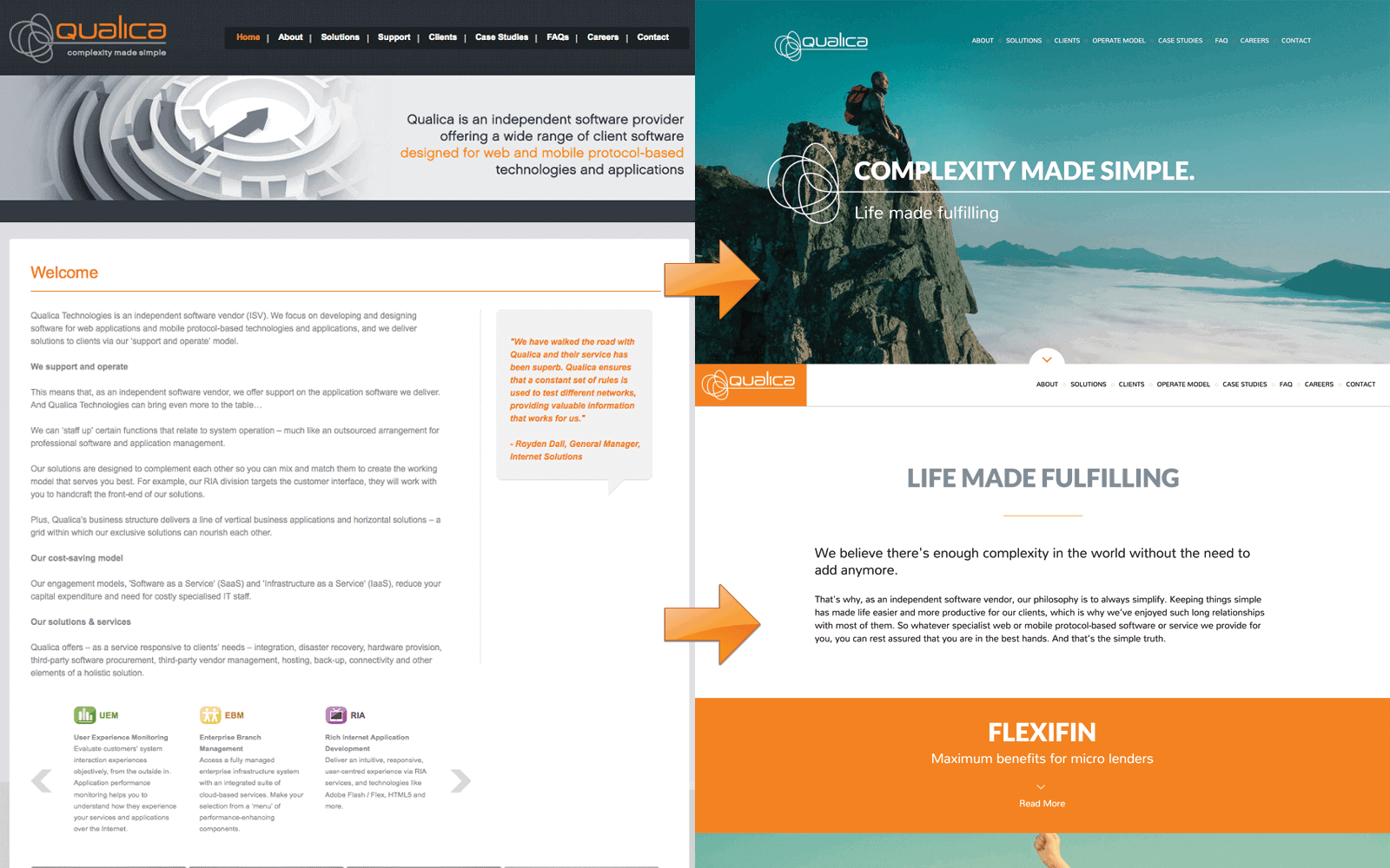
Qualica’s website was outdated, aesthetically and in terms of communicating its services. The company’s slogan – complexity made simple, captures the essence of its solutions and the website had to reflect this.
Challenge
The look and feel of the website was cold and utilitarian with little regard for aesthetics or viewer engagement. Qualica provides financial software solutions to blue chip companies and the website didn’t reflect that it is an industry leader.
The copy typeface was too small and the copy too long. From an aesthetic point of view, the grey type on white meant a tad more concentration was needed to read, and if people can’t be bothered, you’ll lose them.
We felt that the website did not convey Qualica’s brand promise: Complexity made simple. The content of the website was anything but simple.
Solution
DUO proposed copy treatment throughout all the elements to make the text inviting to read. We made the copy shorter and split it up into bite-size pieces with intriguing headlines and sub-headings to break it up.

In terms of the creative strategy, we felt we did not need to recreate the wheel, but recommended that we amplify Qualica’s credentials and simplify the website design, as much of the company’s really good work was hidden away.

Qualica makes heavy use of case histories and testimonials, which can be powerful tools in establishing the brand’s credentials. We advised dramatising the testimonials and using headlines that catch the reader’s attention.

In order for Qualica to own its positioning, the website had to create a stronger perception of simplicity. This meant that the website design had to demonstrate simplicity in every creative element.

Result
Qualica’s brand audit was conducted in September 2015, the creative strategy proposed in October 2015 and the redesigned website went live at the beginning of April 2016.
The updated website features visuals that have a simple, minimalistic quality to enhance the user’s experience. The website content has been simplified and the new headlines build on the brand proposition.
Icons are used to help visitors better understand and interpret information. They quickly sum up what the text is about, increase readability and draw attention.
The brand positioning was the core idea for the website, to ensure that it lives the brand promise. We bolstered the brand positioning by demonstrating the simplification concept the moment someone lands on the website.
Qualica’s new website is visually appealing, original, less copy intensive and highlights the company’s credentials. It lives Qualica’s ethos of simplicity.


